Power BI > Dynamic Scales & Values
WebSiteAdmin, August 31, 201914109 Views
Hello DAX-sters!
We have already created a report where we can choose what data we can show – dynamically. You can refer to the blog here.
How about we get the freedom to choose even how the data can be shown, i.e. weekly, monthly, quarterly, or yearly?
Every so often we need the availability of a custom visual of a bar chart or line chart which gives us an option to whether plot the chart weekly, monthly, quarterly, or yearly. Unfortunately, there are no custom visuals available (as per my search) neither does Power BI provide us with any alternative visuals.
I have come up with a trick which not only lets you choose how to show your data on X-axis i.e. either weekly, monthly, quarterly, or yearly but also lets you choose which data to show on Y-axis.
Please note that this approach might add a little bit more data to your model. If your data is already exceeding the data limit, you need to think about this approach.
Let’s create a report which has a slicer that lets you choose whether to show data weekly, monthly, quarterly, or
yearly. Also, it lets you choose which data to show(here, Sales and Order) as shown below:
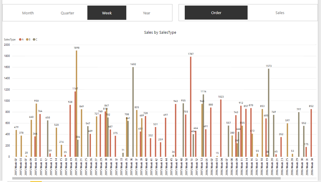
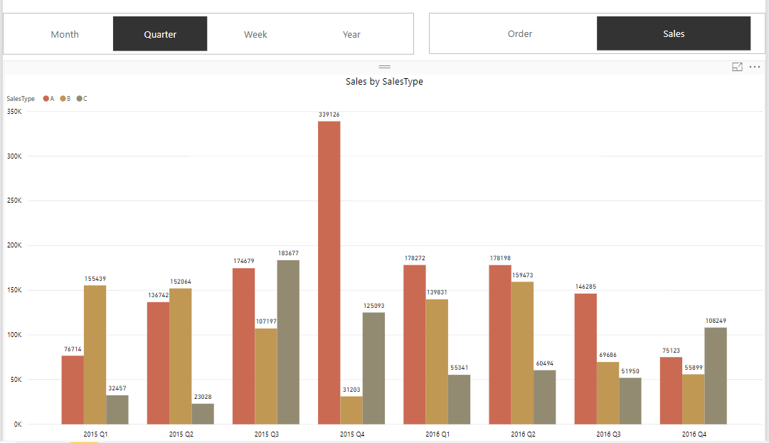
For illustration purposes, we’ll have data on Sales and Order over 2 years.
Let’s start with building some supporting tables.
For the Sales Data, we have a Fact table – FTSales.
And then, we will have the Dates table(DTDates), which can be created by the following DAX formula:
Date:
CALENDAR(DATE(2015,01,01),DATE(2016,12,31))
The table is also required to have the following calculated columns with their corresponding formulae:
Year = YEAR(DTDates[Date])
Month = DTDates[Year]&" "&FORMAT(DTDates[Date],"MMMM")
Quarter = DTDates[Year]&" " & CONCATENATE("Q",ROUNDUP(MONTH(DTDates[Date])/3,0))
Week = DTDates[Year]&" "&CONCATENATE("Week ",RIGHT(CONCATENATE("0",WEEKNUM(DTDates[Date])),2))
DTDates table should look like this:
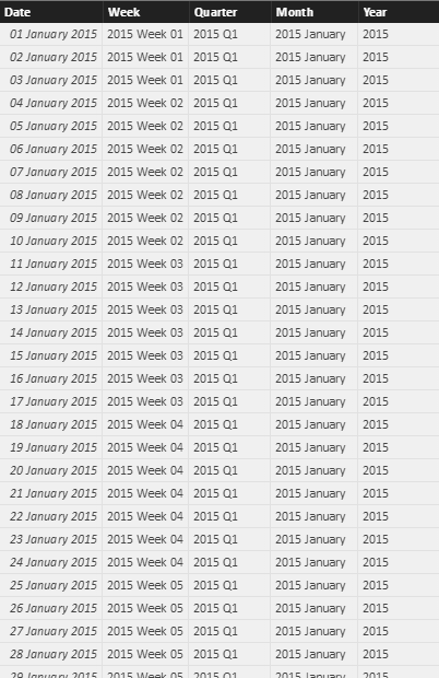
For total Sales and total Order, let’s create basic measures which we would need for plotting:
Total Order = SUM('FTSales'[Order])
Total Sales = SUM('FTSales'[Sales])
With this, we have a basic structure with the Fact table and Date table ready for use. However, we will need to add more tables for this technique to work. Let’s see why we need them & how to build them.
To pick the values for the Slicer, we need to have two dimension tables as in the below images:
For VALUE slicer, we need to have a table, let’s name it ‘DTDynamicSlicer’ which has the following items:

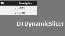
Once done, we would now need a table which bridges the gap between Dimension tables and Fact table.
Hence, to bridge the gap, we need to create a table(let’s name it DateSlicer Table) with a value of each week with the word ‘Week’, value of each quarter with the word ‘Quarter’, same for monthly and yearly.
Hence, here we have data of two years, so records with word ‘Week’ will be (52+52), records with word ‘Quarter’ will be (4 + 4), records with word ‘Month’ will be (12+12) and records with word ‘Year’ will be (1+1).
It can be created using the following DAX formula:
DateSlicer =
UNION (
    SUMMARIZE ( DTDates, DTDates[Week], "Frequency", "Week" ),
    SUMMARIZE ( DTDates, DTDates[Month], "Frequency", "Month" ),
    SUMMARIZE ( DTDates, DTDates[Quarter], "Frequency", "Quarter" ),
    SUMMARIZE ( DTDates, DTDates[Year], "Frequency", "Year" )
)
Let’s rename the column ‘Week’ of DateSlicer table as ‘Value’.
The table would somewhat look like this depending on the data:
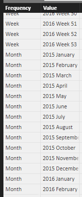
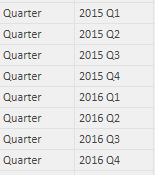
![]()
Now, we need to create relationships between Dateslicer table and FTSales table.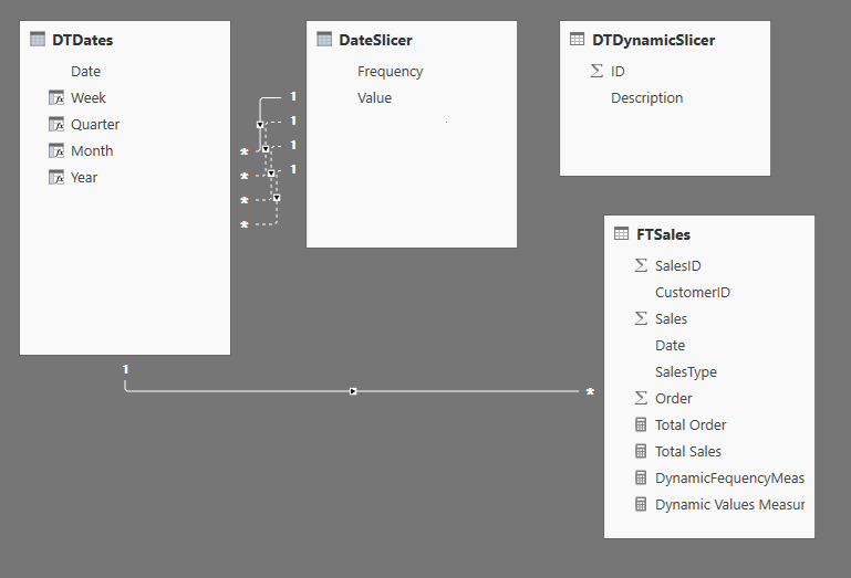
Now, we need to create a measure that calculates Total Order when selected ‘Order’ and Total Sales when selected ‘Sales’.
Dynamic Values Measure =
IF (
    HASONEVALUE ( DTDynamicSlicer[Description] )
        && SELECTEDVALUE ( DTDynamicSlicer[Description] ) = "Order",
    [Total Order],
    IF (
        HASONEVALUE ( DTDynamicSlicer[Description] )
            && SELECTEDVALUE ( DTDynamicSlicer[Description] ) = "Sales",
        [Total Sales]
    )
)
Also, we need to create a measure that calculates weekly, quarterly, monthly and yearly as and when selected.
DynamicFequencyMeasure =
IF (
    HASONEVALUE ( DateSlicer[Frequency] )
        && SELECTEDVALUE ( DateSlicer[Frequency] ) = "Week",
    CALCULATE (
        [Dynamic Values Measures],
        USERELATIONSHIP ( DateSlicer[Value], DTDates[Week] )
    ),
    IF (
        HASONEVALUE ( DateSlicer[Frequency] )
            && SELECTEDVALUE ( DateSlicer[Frequency] ) = "Month",
        CALCULATE (
            [Dynamic Values Measures],
            USERELATIONSHIP ( DateSlicer[Value], DTDates[Month] )
        ),
        IF (
            HASONEVALUE ( DateSlicer[Frequency] )
                && SELECTEDVALUE ( DateSlicer[Frequency] ) = "Quarter",
            CALCULATE (
                [Dynamic Values Measures],
                USERELATIONSHIP ( DateSlicer[Value], DTDates[Quarter] )
            ),
            IF (
                HASONEVALUE ( DateSlicer[Frequency] )
                    && SELECTEDVALUE ( DateSlicer[Frequency] ) = "Year",
                CALCULATE (
                    [Dynamic Values Measures],
                    USERELATIONSHIP ( DateSlicer[Value], DTDates[Year] )
                )
            )
        )
    )
)
Add slicer for the month/quarter/week/year and plot ‘Frequency’ from the ‘DateSlicer’ table.

and add another slicer for choosing whether to show Sales data or Order data, which will be plotted from ‘DTDynamicSlicer’.
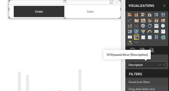
For the main visual, Axis will have ‘Value’ column from DateSlicer table and Value will have our created measure ‘DynamicFrequencyMeasure’.
Plot the visual as follows:
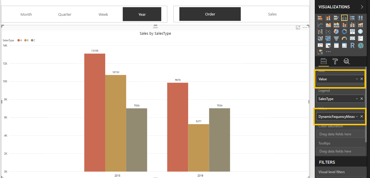
Let us understand how this works,
Suppose, the user selects ‘Week’ in date slicer and ‘Order’ in another slicer.
First, it will calculate DynamicFrequencyMeasure which in turn calculates DynamicValuesMeasure which calculates [Total Order] using the relationship between DTDates[Week] and DateSlicer[Value].
You can thus create dynamic visual with dynamic X-axis as well as dynamic Y-axis with any dynamic values you want with just the power of DAX.
Happy DAX-ting!


I cannot get this to work. My main visual only ever shows the measure for the month. If I select any other frequency, my visual is blank. What could be the reason for this?
Actually, it’s working differently now. I don’t remember what I actually changed, but the x axis (the dates) do not change based on which frequency selection I choose (week, month, quarter, or year). Instead, all of the different frequencies show and depending on the selection I choose, only the corresponding ones are highlighted in the bar chart. For example, if I click “Quarter” in my frequency slicer, the bar chart visual just highlights the data corresponding to the quarters in the years, but all of the others formats are still visible, so I can see 2018, 2019 for my years, 2018 Week 1, 2018 Week 2, etc for my weeks, and so on and so forth.
However, when I use the dates as my column headings in a matrix, it works as expected. Only the date formats corresponding to the selection of the slicer show.
How can I get the x-axis to only show the date formats corresponding to my frequency selection?
I have figured out the issue. I needed to edit the interactions between the slicer and my bar chart to filter by it instead of highlight by it.
Hi Kade! I’m encountering the same issue. I am not able to see anything on quarterly and yearly. Can you help me? I only see monthly.
Thank you in advance!
Did you set up your relationships between the Date table and the Time Selection table correctly?
What should be the relationship between DTDates and DateSlicer tables ? Can I get a snap of the relationship ?
The snapshot of the relationship is in the blog just above the measures.
Please let me know if you cannot see it.
Also, make sure that your “Week”, “Month”, “Quarter” and “Year” columns are of type Text. The “Value” column in the time selection table also needs to be of type Text. This is probably why you don’t see anything. If the types are mismatched, then Power BI filters everything out because nothing matches because they are of different data types.
How can you get the dates to show up sorted on the visuals? Seems rather difficult to sort the ‘Value’ column of your ‘DateSlicer’ table since it has groupings. I don’t see any sort column connected to it and being that the ‘Value’ column is the one being shown in the visual on the x-axis, you cannot rely on your sorted DTDates table, can you?
At least in my case, my time period values are not showing sorted even though they are connected to my date table and my date table columns are all sorted correctly.
How can I fix this?
Hello,
You can create a column for SortOrder and then have your values sorted by the SortOrder column.
Please let me know if you aren’t able to.
Hello, sir! Its amazing and tricky X dynamic axis ability! Many thanks to you. However, I have some difficulties with creation of sorting column in table Date Slicer. Could you please show me how to do it ?
Hello, thanks!
For that, you can use the following DAX for DateSlicer table:
DateSlicer =
UNION (
SUMMARIZE ( DTDates, DTDates[Week], “Frequency”, “Week”,”SortOrder” ,1),
SUMMARIZE ( DTDates, DTDates[Month], “Frequency”, “Month”,”SortOrder” ,2 ),
SUMMARIZE ( DTDates, DTDates[Quarter], “Frequency”, “Quarter”,”SortOrder” ,3 ),
SUMMARIZE ( DTDates, DTDates[Year], “Frequency”, “Year”,”SortOrder” ,4 )
And then you can sort the column by SortOrder.
Please let us know if this is unclear.
)
Hi!
Very nice content.
I’m trying to do something similar, but with no success. Since I can’t post an image in here I’ll try to describe it.
First i must say: I only need a “Date Type” slicer (for Week, Month, Year), and not a “metric slicer”. And that is because the metric should stay static in the graphic, and only the date type used on the X axis should be changed according to what is selected on the slicer.
(1) I have not created a DAX Date Table as you suggested. I already have a Calendar table, with a few Text type fields (name of the month and name of the day of the week, for instance);
(2) I did not create a metric slicer table, since I don’t need a dynamic metric, just a dynamic date, as I explained;
(3) Then I created the “Slicer Table” Using the formula:
SlicerData =
UNION (
SUMMARIZE ( Calendar, Calendar[NameofDay], “Type”, “Day” ),
SUMMARIZE (Calendar, Calendar[NameofMonth], “Type”, “Month” )
)
I then changed the name of the column to “Value”, for organization purposes.
(4) I was able to create a relationship between just one of the Calendar metrics with the “Value” colum of the SlicerData; the other one created an inactive relationship. When I try to activate it, it says “there’s already a visible relationship….”;
(5) Very important to mention that the metric I’ll use to test this has a “date” column that already has a valid active relationship with the Calendar table;
(6) Finally, when trying to create the visualization, using the “Type” field as a slicer that shows “Month” and “Day”, and a line graphic that uses a sales metric and the “Value” field of the slicer table, it ONLY shows data for the item that had the active relationship (Month); the other one (DAY) does not work. I must emphasize that these fields are both in the TEXT format.
Since I dind’t create a “Dynamic Values measure” (I don’t need it), I didn’t do the step where you mention “Also, we need to create a measure that calculates weekly, quarterly, monthly and yearly as and when selected.”;
Any suggestions on how I could proceed or what am doing wrong?
Thanks
I just posted here but it hasn’t been published it.
The problem was not creating the “DynamicFequencyMeasure =” … I just did and it worked fine; instead of using the “Dynamic Values Measures” I used the static metric I need;
Thanks though, your content is very good
Thank you for your comment! 🙂
Hey there!
I must say, it is a pretty nice solution and I was able to get what I wanted. The only issue I’ve been facing is the inability to sort in Chronological order. I have data from multiple years, and they are being sorted alphabetically.
I tried sorting using “Sort by column” as well, but that is also not working.
Hello Simran, can you please share the DAX query for adding the Sort column in the table?