Overlapping Clustered Bar Chart for Estimating Project Completion Dates
What is an Overlapping Clustered Bar Chart?
An overlapping clustered bar chart is a powerful visual in Power BI that helps compare planned vs. actual timelines within the same axis. By plotting Estimated End Dates and Actual End Dates as overlapping bars, project managers can visually track progress, spot delays, and identify early completions.
Overview
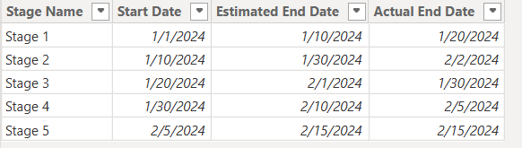
In this scenario, we are working with a project progress tracking dataset. Each stage of the project has:
- A Start Date
- An Estimated End Date
- An Actual End Date
We want to display two visual timelines:
- One for Start Date to Estimated End Date
- One for Start Date to Actual End Date
We aim to overlap the bar visuals to assess how well each stage aligns with its estimated timeline.
Steps to Build the Overlapping Clustered Bar Chart
- Create the Power BI Table with Project Stages
- Ensure your dataset includes Start Date, Estimated End Date, and Actual End Date.
- Load the data into Power BI and confirm column data types are set to Date.
- Step 1: Calculate Actual and Estimated Durations
- Use DAX to calculate the number of days between Start and both End dates.
Actual Days Calculation:
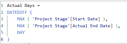
Actual Days =
DATEDIFF (
MAX ( ‘Project Stage'[Start Date] ),
MAX ( ‘Project Stage'[Actual End Date] ),
DAY
)
Estimated Days Calculation :
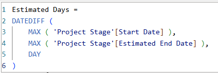
Estimated Days =
DATEDIFF (
MAX ( ‘Project Stage'[Start Date] ),
MAX ( ‘Project Stage'[Estimated End Date] ),
DAY
)
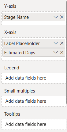
- Step 2: Create Two Clustered Bar Charts
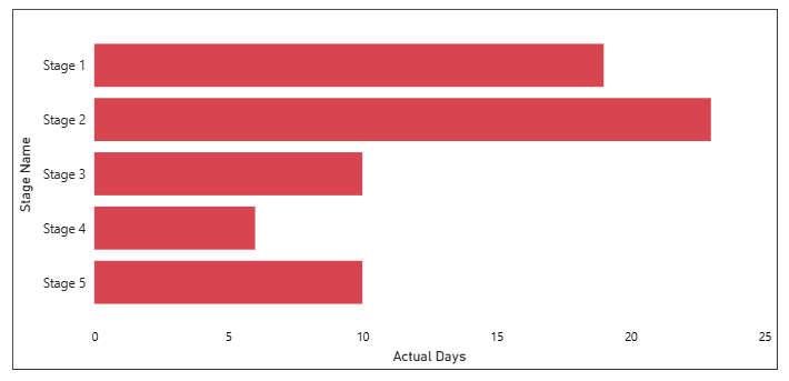
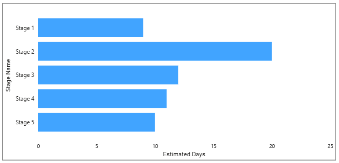
- Add a clustered bar chart and use Stage Name as the Y axis.
- Add Actual Days to the X axis.
- Duplicate the chart and replace Actual Days with Estimated Days.
- Align both visuals one on top of the other to create the overlap.
Actual Days Graph:
Estimated Days Graph:
-
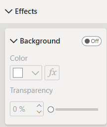
- To ensure the two bar charts blend seamlessly when stacked, turn off their backgrounds.
- Select each visual (Estimated and Actual charts) one at a time.
- Navigate to Format → Visual → Background and toggle it Off.
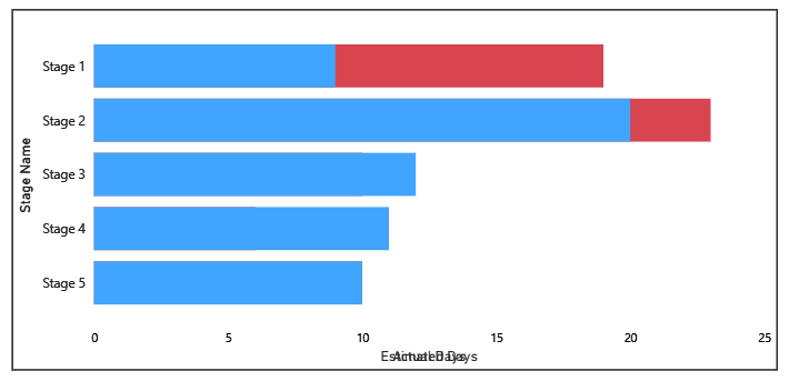
After Overlapping Both:
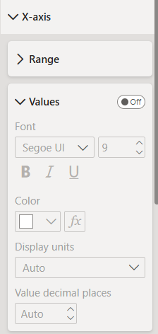
- Step 3: Turn Off X-Axis for Both Charts
To create a clean and cohesive visual overlap, it’s best to hide the X-axis from both charts. This prevents duplicate axis labels and keeps the focus on the bars themselves.
-
- Select each chart individually — both the Actual Days (back chart) and Estimated Days (front chart).
- Go to Format → X-axis.
- Toggle Title, Values, and the entire X-axis to Off.
This ensures that only the visual comparison stands out, without clutter from repeated axis elements.
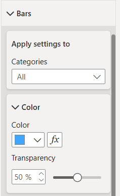
- Step 4: Apply Transparency to Estimated Chart
- Select the Estimated Days chart.
- Go to Format → Bars → Transparency.
- Set it to 50% to allow underlying bars to show through.
This makes the visual distinction between estimated and actual more intuitive.
After applying Transparency:
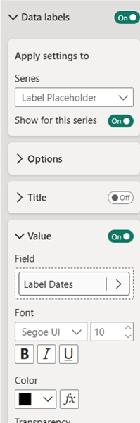
- Step 5: Add Dynamic Labels for Dates
- Use the following DAX to show Start, Estimated End, and Actual End dates together:
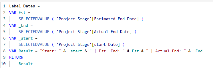
Label Dates =
VAR Est =
SELECTEDVALUE ( ‘Project Stage'[Estimated End Date] )
VAR _End =
SELECTEDVALUE ( ‘Project Stage'[Actual End Date] )
VAR _start =
SELECTEDVALUE ( ‘Project Stage'[start Date] )
VAR Result = “Start: ” & _start & ” | Est. End: ” & Est & ” | Actual End: ” & _End
RETURN
Result
-
- Before adding the actual measure, first add a placeholder field (e.g., any text field) to the Values section of both visuals.
![]()
Label Placeholder = 0
-
- This ensures that the layout of both visuals stays aligned and consistent when you later switch to the final label measure.
-
- Once the placeholder is added, go to the Format pane → Data labels.
- Apply the necessary settings to enable data labels, and then select the Label Dates measure in the “Values” field.
- This ensures the correct date information appears directly on the bars.
After Applying the date Label:
- Step 5: Set a Dynamic X-Axis Range
- Purpose :
- To ensure both charts align perfectly, it’s important to use a custom dynamic range on the X-axis.
- Without this step, each chart may display a different X-axis scale, since Actual Days and Estimated Days can vary significantly. This can mislead viewers and break the visual comparison.
- Use the following measure to ensure the X-axis adjusts automatically as values grow in the multiple of 5:
- Purpose :
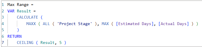
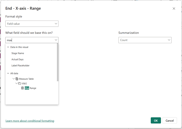
Max Range =
VAR Result =
CALCULATE (
MAXX ( ALL ( ‘Project Stage’ ), MAX ( [Estimated Days], [Actual Days] ) )
)
RETURN
CEILING ( Result, 5 )
-
-
- After creating the measure, go to the Format pane → X-axis for both charts.
- Set the Maximum range dynamically by referencing this new measure.
-
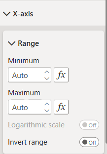
-
-
- Go to Format → X-axis, click on the fx button next to Maximum, and select the Max Range measure to apply dynamic scaling.
-
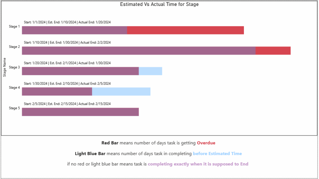
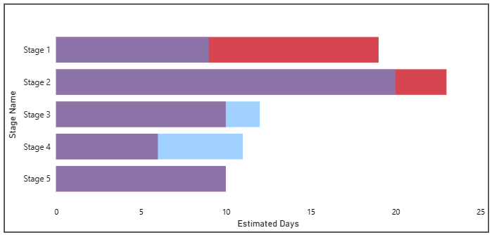
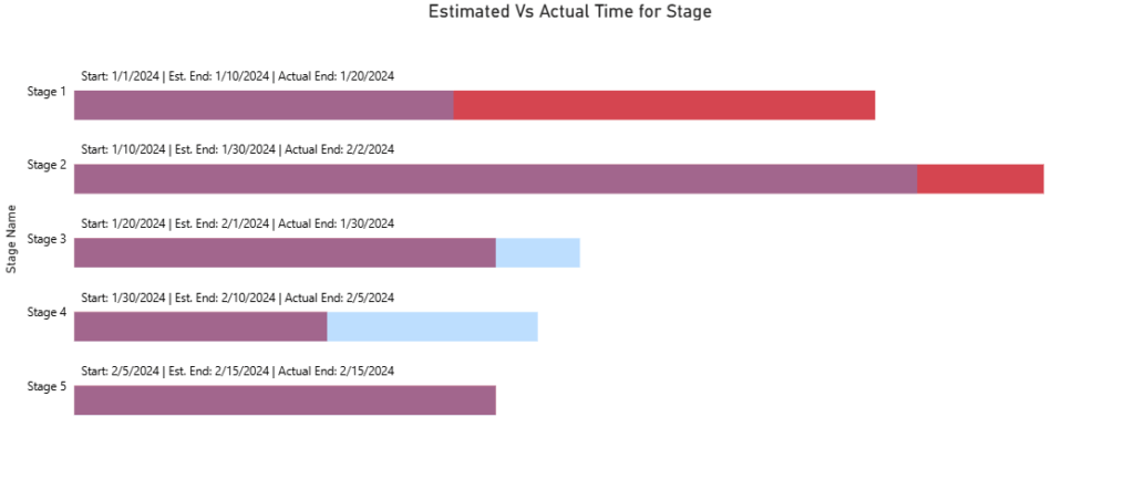
Visual Interpretation
🔵 Light Blue (bottom bar) = Actual duration
🟣 Purple (overlap of estimated + actual) = On-time completion
🔴 Red (extends beyond estimated) = Delay
Conclusion
- Overlapping clustered bar charts in Power BI offer a compelling visual for comparing timelines in project management. With simple DAX measures, dynamic axes, and smart color use, these charts provide clear insights into which stages are running on time, early, or delayed.
- Whether you’re a data analyst, project manager, or dashboard designer, this method will bring clarity and style to your project tracking reports.