
Power BI > Using slicer for just highlighting values without filtering
WebSiteAdmin, December 20, 202111614 Views
The general purpose of slicer visual in Power BI is to filter the data points in the report and view only the filtered information. They provide options (single or multiple) to a user, to click on & filter the visuals on the page.
Recently, in one of our projects, we were tasked with a requirement to highlight the bars of a bar chart instead of filtering the visual based on the selected value of the slicer. It sounded odd at first but after spending some time on it, we could come up with an approach to handle this requirement. We thought that to do this, we could use the conditional formatting feature for the visual plotted. And then, this could be achieved by incorporating some logic inside a measure, which can then be used as a Field Value while applying conditional formatting to the visual.
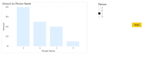
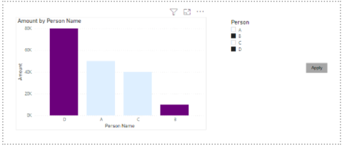
Let’s see how our final output looked like:
Here, we can see the color of the bar chart changing according to the selections made in the slicer which gives us impression of the bar getting highlighted.
Now let’s look on how we achieved the same.
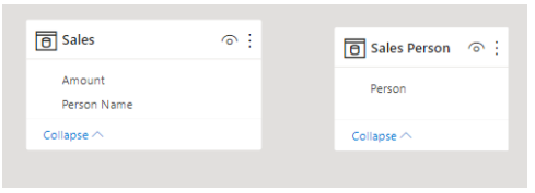
For illustration, we have ‘Sales’ table with the following fields:

Here, the user will select the Person from the slicer and the data bar for that particular person will be highlighted.
First, we need to make a copy of the ’Sales’ Table – the one that we want in the slicer, and make sure there is no relationship between the two tables, because by doing so, the visual will get filtered which is against our requirement. And let’s call this newly copied table as ‘Sales Person’.
Next, in the bar chart, plot Total Amount against Person Name from ‘Sales’ table and plot the Person field from the ‘Sales Person’ table in a slicer. As there is no relationship between the two tables, the slicer won’t be filtering the data points of the bar chart.
Now, we will create a measure named ‘Highlight’ which will be used for conditional formatting of the data color of the bar chart.
Highlight =
VAR SelectedName =
    ALLSELECTED ( 'Sales Person'[Person] )
RETURN
    IF (
        ISCROSSFILTERED ( 'Sales Person'[Person] ),
        IF ( MAX ( 'Sales'[Person Name] ) IN SelectedName, 1, 0 ),
        0
    )
Let’s understand how this works.
The variable ‘SelectedName’ stores the value/s selected from the slicer. Then, if the selected value/s from the slicer matches the value/s of the plotted Person Name data field from the visual, then we return value 1 else we return 0. If there is no selection from the slicer, then the measure always returns 0.
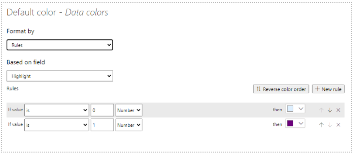
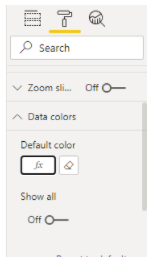
Now we will use this logic for applying conditional formatting to the data colours of the bar chart as below. If the value is 1, then we will use a dark colour (for the highlighting effect) and if it is 0 then it will be light colour.
This is how our output would look like after applying the conditional formatting!!
Happy DAX-ting!


Awesome, succinct explanation. Saved me an enormous amount of time. Kudos on the post.
I really enjoyed this article and have been wanting to something like this for some time.
I do have problem, when I select a bar to highlight the remaining bars disappear and return when I deselect the bar to highlight.
I have been looking at this for some time, but have not found why this behavior is occurring.
Any ideas or suggestions would be greatly appreciated.
Hello Pierce Brown,
If you are cross-filtering from the other visual, it is likely to filter just the selected value and filter out all the others. You can do one thing for that –
Select the visual from where you are selecting the value, go to Format > Edit Interactions. And then click on the below icon on the other visual where you want to see the highlighted bars.
Thanks for your post.
I had a similar challenge and your approach was an inspiration to mine!
In my case I wanted to allow a single selection over a column chart which grouped various items. My intent was highlighting the column which contained the value selected in the slicer.
My measure:
Highlight =
VAR SelectedName =
SELECTEDVALUE( ‘Country Name'[Country List] )
VAR Countries =
VALUES(Data[Country Name])
RETURN
IF (
ISCROSSFILTERED( ‘Country Name'[Country List] ),
IF ( SelectedName in Countries, 1, 0 ),
0
)
Thanks for your post.
Your approach helped me a lot in a similar challendge.
I wanted to highlight a single-selected value from a slicer in a column chart which contained multiple values per column,
My measure:
Highlight =
VAR SelectedName =
SELECTEDVALUE( ‘Country Name'[Country List] )
VAR Countries =
VALUES(Data[Country Name])
RETURN
IF (
ISCROSSFILTERED( ‘Country Name'[Country List] ),
IF ( SelectedName in Countries, 1, 0 ),
0
)